


Leading Change Through Design: The Evolution of Publicis Toronto’s Visual Identity

A Legacy Etched in Innovation
In 1926, Marcel Bleustein-Blanchet made his mark - quite literally - on a door in France. With a few bold strokes, he set the foundation for Publicis, a brand built on the principle that change is not something to react to, but something to lead. Almost a century later, those very strokes inspired Publicis Toronto’s radical new typography system, merging past and present to craft a truly unique visual identity.
“Publicis Toronto embarked on a deeply collaborative journey, engaging its entire team in a process of reinvention. By blending Marcel’s original letterforms with their own contributions, the team didn’t just design a font - they breathed new life into the agency’s identity. The result was more than typography; it became a living expression of Publicis’ core philosophy: to lead the change,” said Victor Yves, head of art at Publicis Toronto.

A Typeface Born from Collaboration
This was not merely a design project - it was a collective act of co-creation.
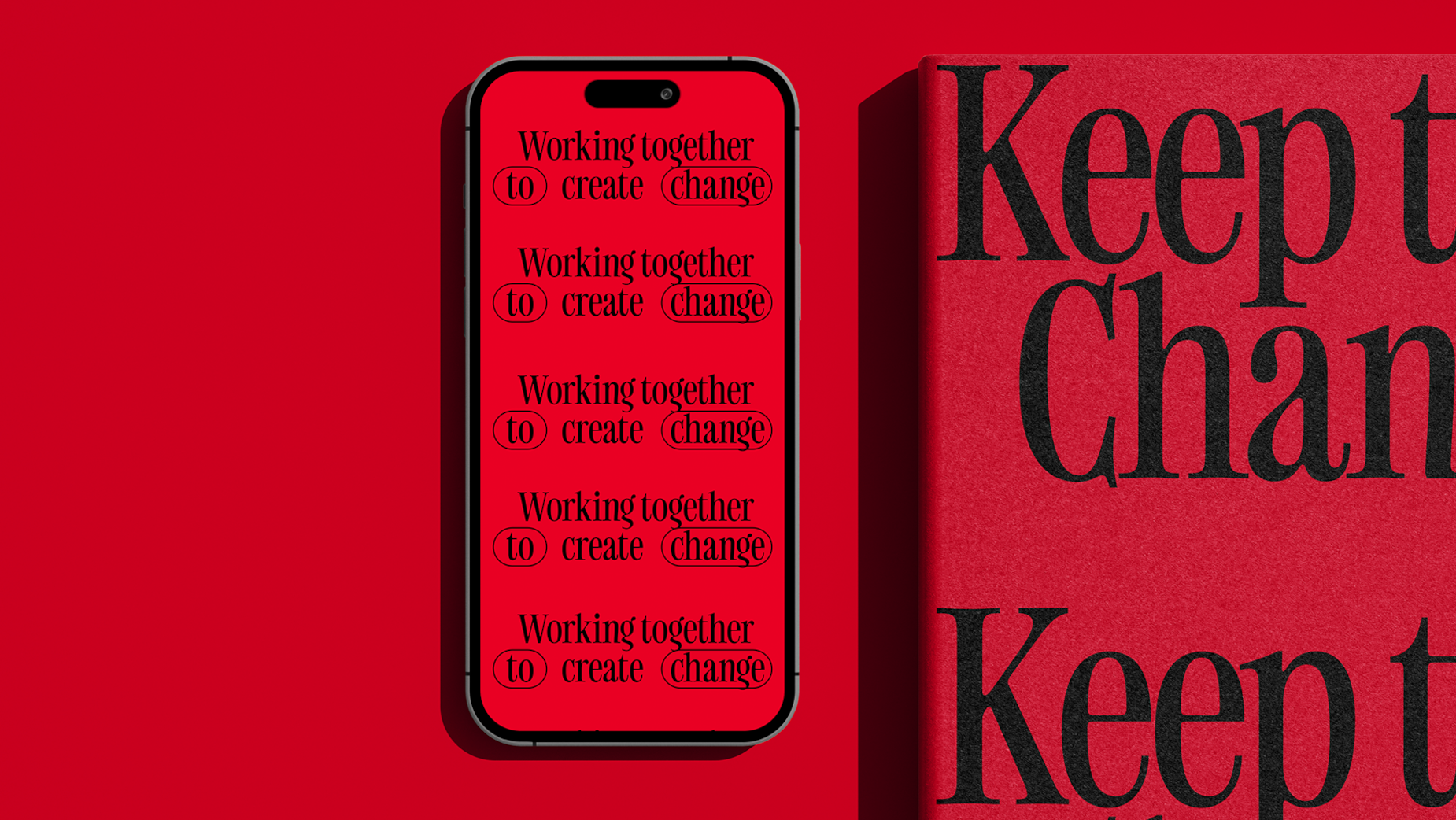
Inspired by Marcel’s handmade Publicis logo, the team developed a typography system rooted in the geometric precision of its original strokes. Yet, true innovation came in its evolution: each Publicis Toronto employee contributed handwritten letterforms, fusing historical foundations with modern individual expression.

The outcome was a typeface that bridges eras - both timeless and contemporary.
Characterised by wide proportions, rounded curves, and ink traps reminiscent of traditional printing techniques, the typeface pays homage to its origins while embracing modern aesthetics. Arcs that resolve in flat edges add a distinct, structured rhythm, reinforcing the agency’s commitment to change and progression.
Strategy: A Brand Evolution, Not Nostalgia
Publicis Toronto’s transformation was not about looking back - it was about moving forward. The agency’s Lead the Change philosophy emphasises that brands do not merely survive by adapting; they thrive by shaping the future.

Rather than imposing a singular vision, Publicis Toronto built its identity collectively, ensuring every employee played a role in its design. This collaborative methodology underscored the idea that change isn’t driven by one person alone - it is a shared effort. The new typeface became a symbol of Publicis’ past and its dynamic, ever-evolving future.


